
Overview
DealDey is an e-commerce site featuring daily deals on products and services from merchants across the country. DealDey has over 1 million users and over 15,000 active merchants.
Dealdey’s website grew exponentially within a short period, with new features added weekly without validation or testing. This created usability issues in the long run as users struggled to complete a purchase on the site.
We analyzed quantitative and qualitative data and discovered that 70-80% of customers abandon their carts during the checkout process.

Problem Statement
The checkout process was too complex and time-consuming, resulting in a diminished experience for shoppers, which ultimately had adverse effects on the business with dwindling sales and loss of revenue.
Solution
Identify drop-off points, remove impediments from the checkout process and improve the overall flow.
My Role
Determine the overall design direction of the project while communicating design decisions to key stakeholders. I worked with 2 other designers, 3 developers, a product owner, and scrum master.
I synthesized research findings, created paper sketches, wireframes, prototypes, and evaluated designs through usability testing.
We employed a design thinking process to make sure that design decisions were supported by feedback.
01. Empathize
Research & Discovery
We ran a survey with 20 participants and conducted interviews with 8 customers. The goal was to uncover the challenges faced by customers, understand their needs, and explore ways to proffer a human-centered solution.
Findings
- The checkout process had too many steps.
- Users could not make changes on their “Order review” page.
- Customers were forced to create an account, and the information required was unnecessary.
- Validation errors & data persistence dithered progress.
Recommendations
- Redesign a seamless checkout process.
- Remove unnecessary data requirements from the process.
- Improve the “Order Review” page for a better user experience.
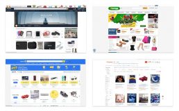
Competitor Analysis
I also analyzed other competitor websites in the e-commerce space, including Amazon, Groupon, eBay, Konga, Jumia, and AliExpress. Gaining some inspiration and identifying common framework and design patterns.
02. Define
Persona
After synthesizing all the data from the user research, I created this persona to gain a deep understanding of the target audience.

Current User Flow
I also created this flow highlighting the current steps involved in the checkout process.

03. Ideate
Paper Sketches
I explored multiple ideas for reducing the information required during checkout, focusing on what’s most important to fulfill an order.
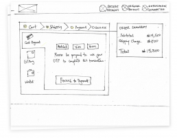
Lo-fi Wireframe
I then created the low-fidelity wireframes to show the rest of the team.
04. Prototype & Test
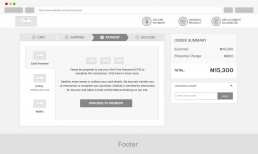
Hi-fi Prototype
After discussing with the team and gaining consensus on the wireframes, I prototyped the high-fidelity UI screens, ready to be tested with real users.
The feedback we got from the user was; although they loved the simplification of the individual pages, the steps still felt long.
Iterations
Revised User Flow
I had to go back to the drawing board and explore how we could reduce the steps involved to provide a seamless checkout experience.
After exploration, I discovered that we could actually skip the shipping & payment detail pages for return users since they already saved this information. Hence direct them to the order review page for confirmation.

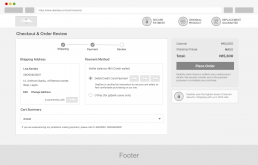
Revised Wireframe
I collaborated with the dev team to create this wireframe. We discussed technical feasibility, business expectations, and other considerations while also considering the project’s time constraints.
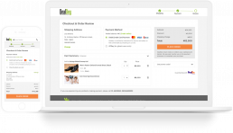
Revised Prototype
I reduced the checkout process from 6 to 4 pages with the revised user flow, updated the prototypes, and prepared for another round of usability testing.

After conducting the tests, 9 out of the 10 participants loved the simplified process, highlighting how this will help them check out faster.
I gathered the feedback from the session and created the final screens with clear objectives and right design decisions, putting the finishing touches and updating all the necessary little details.
05. Implement
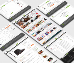
Final Designs
I worked closely with developers to reach the end goal. My background in web development helped in establishing a good rapport with the team. The hand-off was a success because they were carried along in the process. Hence no surprises.
Impact
15%
Increase in Sales
52%
Customer Satisfaction Rating
34%
Reduction in Cart Abandonment
Learnings
I realized the importance of getting the development team involved from the start. We were able to work out what the team will build and in what order, this reduced frictions that often plague teams.
Next Steps
- Determine and refine all possible user flows and set up the corresponding pages and actions.
- Optimize the checkout flow for both iOS and Android mobile apps.
Let’s Connect
For any questions related to mentorship, portfolio/resume review, and career advice. Drop a message. I’ll be in touch shortly.